
Figure 1: Study questions and the derivation of a baseline, pre-vaccination signature predictive of response using an influenza fever vaccination cohort.
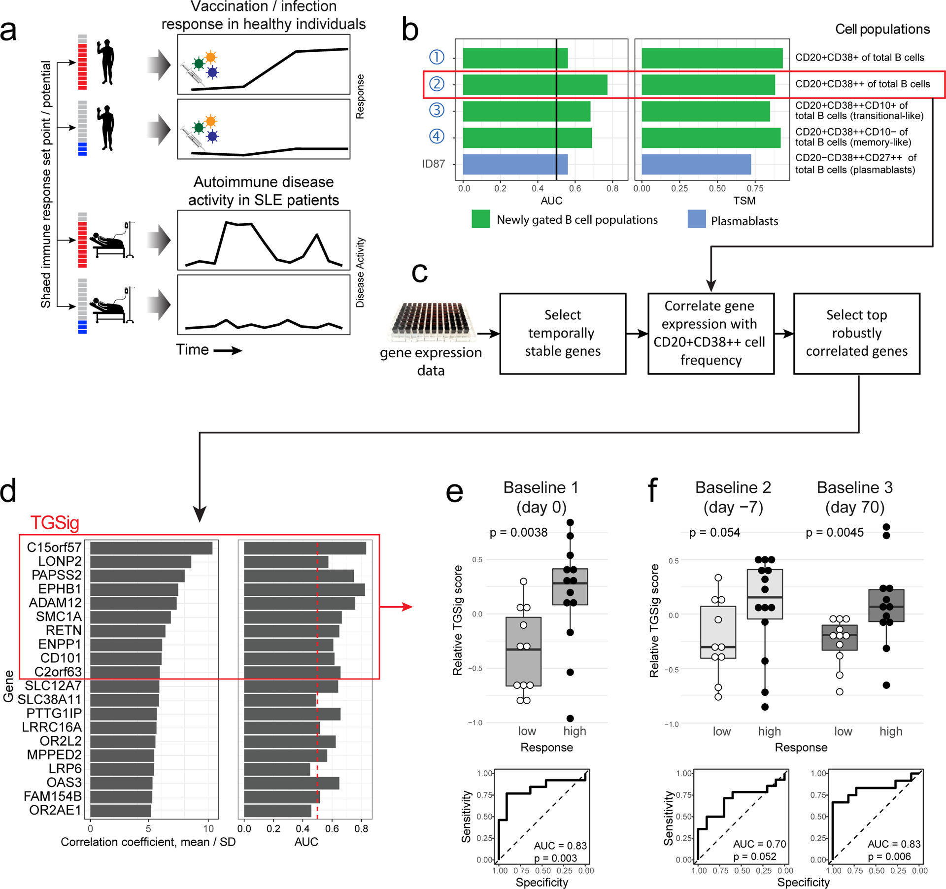
a, Overview of the study and research questions. b, Prediction performance for antibody response in the NIH influenza study12 using the frequency of several B cell subsets (y-axis) (see Methods and gating strategy outlined in Extended Data Fig. 1a). The left panel shows the AUC (area under receiver operator curve; x-axis) for predicting high and low responders (n = 23 with flow cytometry data) to the seasonal and pandemic H1N1 influenza vaccines in ref.12. The right panel shows the temporal stability metric (TSM) (x-axis); higher TSM indicates greater temporal stability over the three baseline time points (days −7 and 0 prior to vaccination and day 70 after vaccination) using 136 samples from 51 subjects. Population 2 (red box) is the CD19+CD20+CD38++ B cell population. c, Flow chart showing the steps to derive the gene expression-based surrogate signature (TGSig). d, Top temporally stable genes correlated with the frequency of CD19+CD20+CD38++ B cell and the selected genes in TGSig (red box). 22 high and low responders (those with both gene expression and flow cytometry data) are used to assess correlations and rank genes. Genes are ranked based on the average Spearman correlation divided by the standard deviation obtained from 231 iterations (as a safeguard against noise we iterated over all sub-cohorts containing 20 subjects by taking out 2 random subjects at a time [i.e., excluding 2 out of 22 subjects] to assess the correlation). See Extended Data Fig. 2a–d and Methods for further details about temporal stability, gene selection, and signature score calculation. e, Top: box plots comparing the TGSig score (y-axis) at day 0 (pre-vaccination) between low (n=11) and high (n=13) responders (x-axis) (Wilcoxon one-tailed p value shown); bottom: receiver operating curve (ROC) for assessing predictive capacity (area under the curve (AUC) and one-tailed permutation test p value shown). Boxplots’ center line corresponds to the median value, lower and upper hinges correspond to the first and third quartiles (the 25th and 75th percentiles); lower and upper whiskers extend from the box to the smallest or largest value correspondingly, but no further than 1.5x inter-quantile range. f, Similar to (e) but for the other two baseline time points: days −7 (10 low and 14 high responders) and day −70 (11 low and 12 high responders).