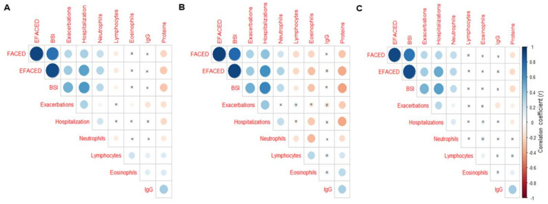
Figure 4.
Correlation matrix of the disease severity and analytical variables, in which the positive correlations are represented in blue, while the negative correlations are represented in red: (A) all the study patients, (B) patients in the below-threshold cluster, and (C) patients in the above-threshold cluster. The intersection within the circle represents a p-value > 0.05. The color intensity and the size of the circle are proportional to the correlation coefficients, as indicated in the Y-axis on the right-hand side of the graph.

