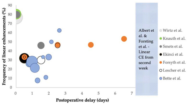
Figure 2.
Bubble chart showing the total frequency of linear enhancements (y-axis) at different time intervals during or after surgery (x-axis), with the median of each reported time interval registered on the x-axis. The size of the bubble represents the total number of patients who had MRI performed, up to 86 patients for Wirtz et al. [29]. Each study is presented with a different colour as shown in the legend. Plots for Ekinci et al. [15], Lescher et al. [16] and Forsyth et al. [31] were calculated by the authors of this review using data from each paper. All grades of linear enhancement are shown for Forsyth et al. Abbreviations: CE, contrast enhancement.

