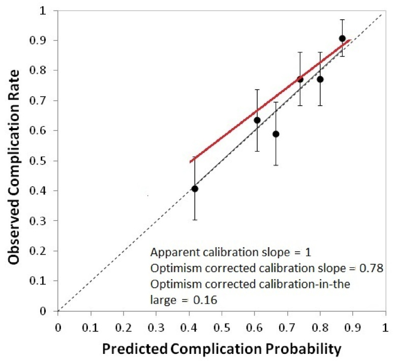
Figure 1.
Calibration plot for the model for grade ≥ 2 acute salivary dysfunction in the nasopharyngeal cancer cohort use for model development. Calibration plots present the rate of observed events in a group of patients (y-axis) vs. the mean predicted probability for the same group (x-axis). Groups of patients are ordered for increasing predicted probability. Error bars represent the confidence interval in observed frequencies calculated from proportions in the study population and based on a normal distribution of events. The dotted line is the identity line, identifying perfect calibration, the continuous black line is the apparent calibration line, and the red line is the calibration line after correction for optimism. Calibration slope and calibration-in-the-large are also reported.

