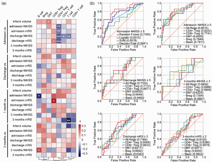
Figure 2.
Correlation matrix between the percentage of lymphocyte subsets and neurological outcomes and Receiver operating characteristic (ROC) curves for predicting stroke severity and prognosis. (a) Heat map used to visualize correlations between the percentage of different clusters of lymphocytes at different time points and infarct volume, NIHSS and mRS score at admission, discharge, and 3 months. The color bar represents Spearman r value and star symbols (*) represents for statistical significance. Heatmap was drawn by R package pheatmap, clustered by columns. *: p < 0.05, **: p < 0.01, ***: p < 0.001, no symbol: no statistical significance. (b) ROC curves for prediction of poor admission NIHSS (NIHSS ≥5) using Random Forest (purple line), Logistic regression (red line), Support Vector Machine (SVM) (green line) and Decision Tree (blue line) models (Top left); for prediction of poor admission (Top right), discharge NIHSS (NIHSS ≥5) (Middle left), 3-month NIHSS (NIHSS ≥2) (Middle right), discharge mRS (mRS ≥3) (Bottom left) and poor 3-month mRS (mRS ≥2) (Bottom right) using Logistic regression model. “Basic” (dotted black line): factors including age, sex, past history of hypertension, diabetes and disorder of lipid metabolism, and habits of drinking and smoking, tPA treatment and infarct volume. “CD4+ Treg”(green line), “CD8+ Treg” (purple line), “DNT” (blue line), “Breg” (yellow line): “Basic” adding CD4+ Tregs/lymphocytes, CD8+ Tregs/lymphocytes, DNTs/lymphocytes, or Bregs/lymphocytes respectively; “All Regs” (red line): “Basic” adding Bregs/lymphocytes, CD4+ Tregs/lymphocytes, CD8+ Tregs/lymphocytes, and DNTs/lymphocytes. Decimals in brackets: area under the curve (AUC). NIHSS: National Institutes of Health Stroke Scale; mRS: modified Rankin Scale.

