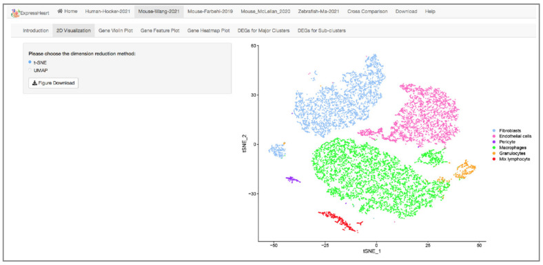
Figure 2.
Interface of 2D visualization via UMAP/t-SNE for the Mouse-Wang-2021 dataset. On the left panel, users can choose different dimension reduction methods; the corresponding 2D UMAP/t-SNE plot is presented on the right. Each dot represents a cell/nucleus, and different colors correspond to different cell types.

