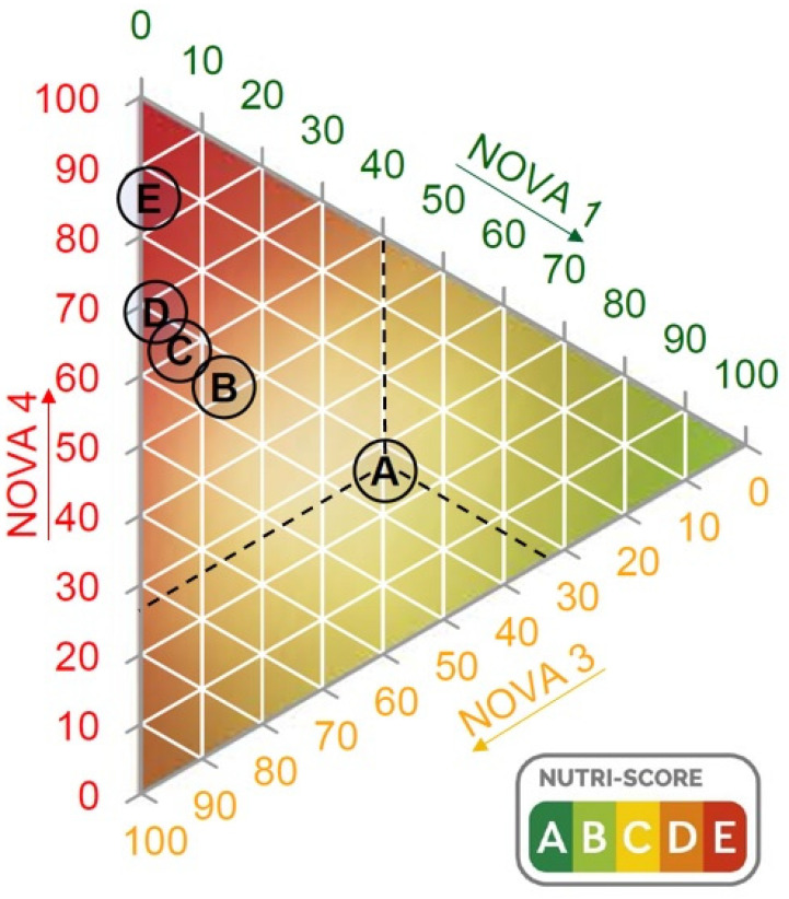
Figure 3.
Ternary diagram representing the Nutri-Score categories in accordance with their positions on each of the three axes. Each axis represents the percentage of NOVA groups 1, 3 and 4. NOVA 2 is not shown as it only represented 1% of the data. The dashed lines indicate the coordinates of the different NOVA groups leading to the point where Nutri-Score category A is located (as an example for interpretation).

