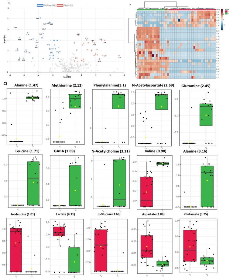
Figure 4.
(A) Volcano plot representing fold change in the dysregulated metabolites for glioma vs control group. Left and right panels of the plot respectively indicate the down- and upregulated spectral regions. Alanine (1.47) was identified as most significant metabolite with highest value of –log10(p). (B). Heatmap of top 30 spectral regions identified for glioma vs control group. Class 1 represents the glioma samples while class 2 the control group. Each colored cell corresponds to normalized intensity value of selected feature. The difference(s) between the two groups can be visualized by change in color. Upregulated and downregulated spectral regions can be seen clearly in two classes. (C) Box and Whisker plots of two groups (1=glioma, 2=control) representing mean change in intensity values of the selected metabolites. Notch of the plot indicates the median value while yellow diamond shows mean value of the feature in the group.

