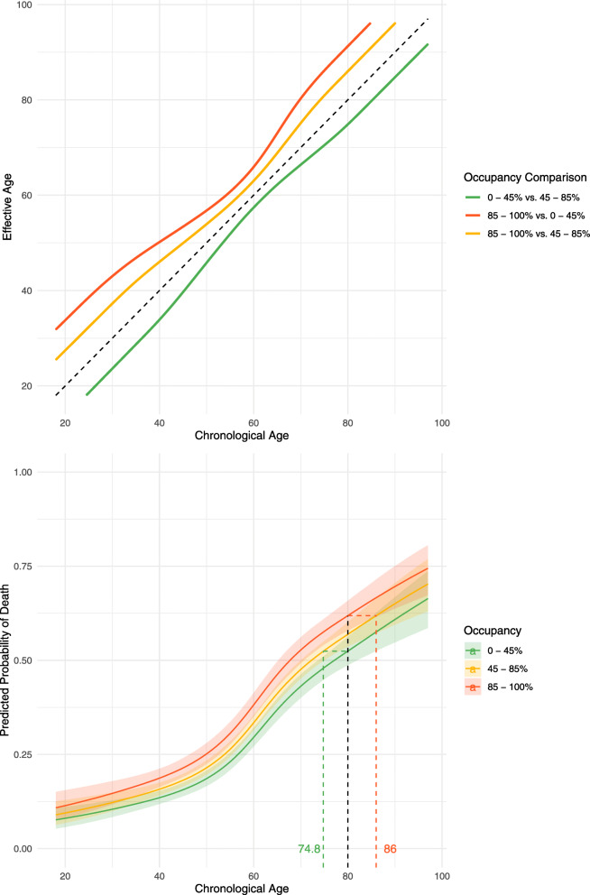
Fig. 3.
The increase in mortality risk associated with admission to intensive care during periods of different occupancy rates, expressed in terms of the equivalent increase in years of age. (Left) The predicted mortality curves arising from predictions made by the primary model across a range of age values for a white male patient is shown alongside 95% credible intervals in a ribbon either side of the median line. The black dotted line intersects all three curves; the 0–45% and 85–100% occupancy curve y value probabilities can then be used to solve back onto the reference curve to determine effective ages of equal risk to the chosen age under reference 45–85% occupancy, shown by the corresponding green and red dotted lines respectively [23]. (Right) The plot illustrates the number of years of additional age that ICU admission on a day with each different mechanical ventilation bed occupancy rate equates to. For example, an individual with a chronological age of 40 has an effective age of 31 in a low occupancy setting (green) and 45 in a high occupancy setting (orange). Both of the aforementioned comparisons are relative to the baseline occupancy of 45–85%). A comparison of the difference in risk between being admitted to the highest occupancy range relative to the lowest is shown in (red) and for a 40-year-old is equivalent to an increase in their age by 11 years

