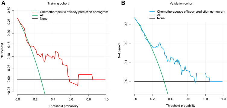
Figure 4.
Decision curve analysis for the chemotherapy efficacy prediction nomogram. (A) The red line represents the chemotherapy efficacy prediction nomogram of the training cohort. When the threshold probability is between 1% and 58%, the nomogram has a relatively good net benefit. (B) The blue line represents the chemotherapy efficacy prediction nomogram of the validation cohort. When the threshold probability is between 4% and 67%, the nomogram has a relatively good net benefit.

