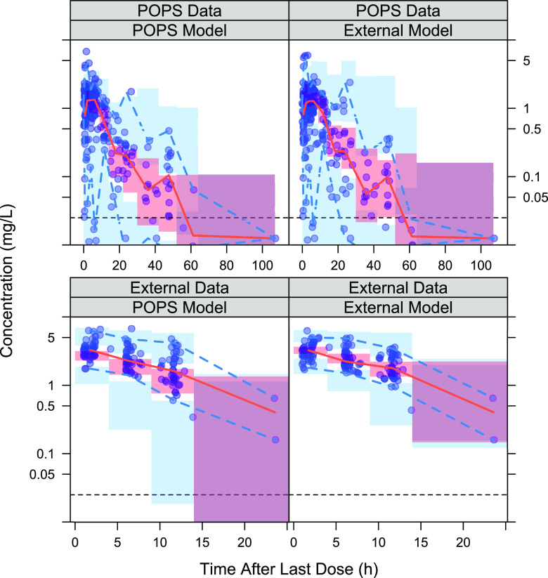
FIG 3.
pcVPCs for each TMP model–data set combination. The red shaded region represents the simulated 95% prediction interval for the median; the solid red line represents the observed median; the blue region represents the simulated 95% prediction interval for the 2.5th and 97.5th percentiles; the dashed blue lines represent the observed 2.5th and 97.5th percentiles; and the horizontal dashed black line represents the lower limit of quantification.

