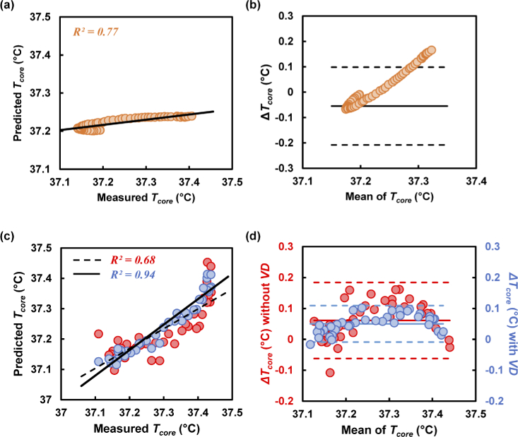
Fig. 6.
(a) Tcore prediction at the thermal phase. (b) Difference between predicted and measured Tcore (ΔTcore) plotted against the mean Tcore. (c) Scatter plot between measured and predicted Tcore at the relaxing phase. The red and blue circles represent the predicted values excluding and including VD, respectively. The black straight and dashed lines in the scatter plot represent agreement between the measured and predicted values including and excluding VD. (d) Bland–Altman plot showing the limit of agreement for predicting Tcore including and excluding VD in the MLR model.

