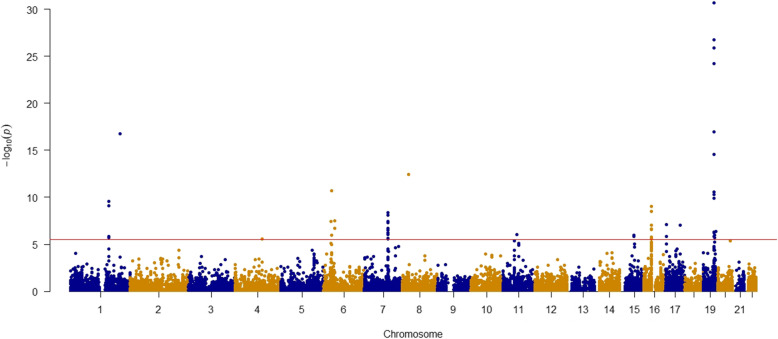
Fig. 1.
Manhattan plot of association results from the Alzheimer’s disease transcriptome-wide association study. The x-axis represents the genomic position of the corresponding gene, and the y-axis represents -log10-transformed association combined P value, which is derived from individual p values from single tissue model-based analyses. Each dot represents the association for one specific gene. The red line shows combined P = 3.38 × 10⁻⁶ based on 14,787 tests. The top two associations of TOMM40 and APOE with P < 2.38 × 10−134 are not shown in this figure

