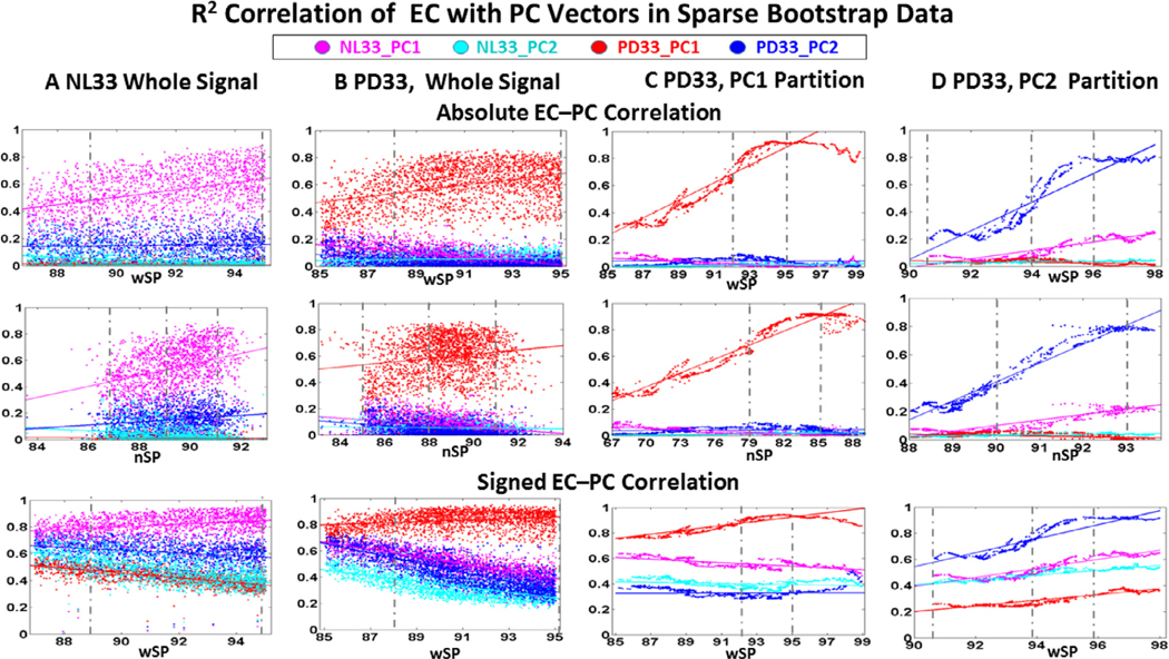
Fig. 5. Pearson’s correlation of EC with PC region weights in bootstrap samples.
Top: The top two rows represent r2 correlation between the EC of each data set with the absolute region weights of the healthy and disease PCs plotted against whole brain sparsity (1st row) and connected network sparsity (2nd row). Bottom: The last row is the r2 correlation of the signed PC weight with the EC vector signed similarly to the PC vector and plotted against whole brain sparsity. Colors correspond to the assigned color of the PC in the legend for which EC correlation is evaluated (red for PD33_PC1, blue for PD33_PC2, magenta for NL33_PC1 and cyan for NL33_PC2). Dashed vertical lines represent visible limits for the range of lower and higher sparsity values for which the correlation was considered to be stable and was used in further analysis of the most robust connections.
A: NL33 whole brain data; samples 200, 1730 cases, B: PD33 whole brain data; samples 200, 2319 cases, C: PD33_PC1 partition data; samples 500, 2015 cases, D: PD33_PC2 partition data; samples 400, 1932 cases.

