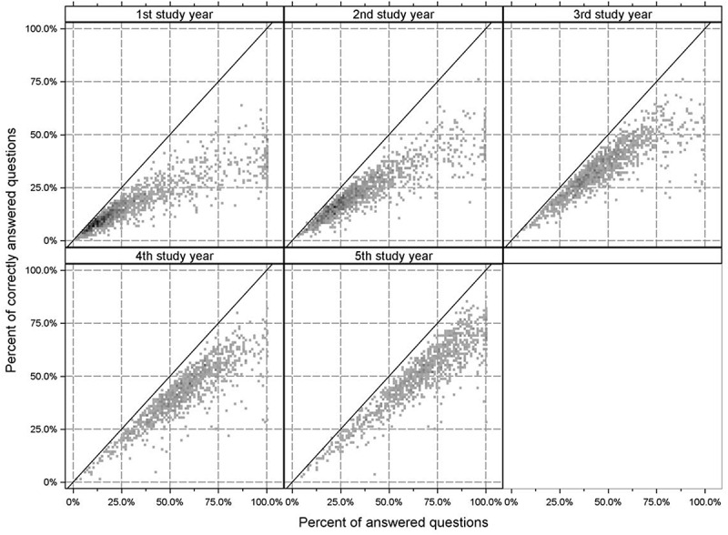
Figure 2.

Relation between the number of answered questions and the percentage of correctly answered questions. Data is shown per study year. Darker grey to black color indicates increased density of data points. The straight line marks the maximal reachable percentage of correct answers given the percentage of answered questions. The data shows that students, while getting more confident in answering questions. Over time, students increase their knowledge and give more correct answers with proceeding study years
