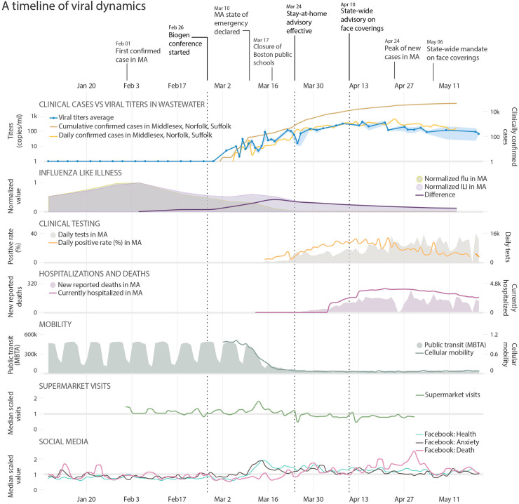
Fig. 2.
A timeline of viral dynamics in the context of key events and clinical/behavioral data. Trends are plotted in the same time frame, from January 8 to May 20. Row 1: Timeline of COVID-19 pandemic and important events in MA. Row 2: Clinical Cases vs Viral concentrations in Wastewater: Viral concentrations in wastewater (blue line along the primary y-axis, shaded area represents the minimum/maximum of PMMoV-adjusted viral concentrations), daily (orange line) and cumulative (brown line) confirmed cases along the secondary y-axis. Influenza Like Illness: Visits for influenza-like illness (ILI, purple shading) and confirmed flu cases (light green shading), and the difference between the two after normalization (purple line), which shows a peak of non-flu ILI at March 18. Clinical Testing: Daily SARS-CoV-2 tests and positive rates in MA. Hospitalizations and Deaths: New reported COVID-19 related deaths and hospitalizations in MA. Mobility: Public transit and cellular mobility data. Supermarket Visits: Supermarket visits in MA (normalized by the median value). Social Media: Facebook posts with terms expressing “Health”, “Anxiety”, and “Death”. Dashed lines in all the panels represent the date of the Biogen conference, the stay-at-home advisory in MA, and the state-wide face covering advisory. (For interpretation of the references to color in this figure legend, the reader is referred to the web version of this article.)

