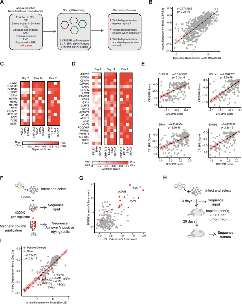
Figure 1. CRISPR screens prioritize rapidly lethal in vivo relevant dependencies.
A, Diagram of gene selection and library design for neuroblastoma specific secondary screens. B, Scaled gene level dependency scores calculated with CERES from the DepMap screen (y-axis) are compared with scaled gene level dependency scores calculated with MAGeCK in our secondary screens at the same time point (21 days). Data for all 214 genes and all four cell lines are plotted. The Pearson correlation coefficient and p-value are shown. Individual cell lines are plotted in Fig. S1A. C, Heat map of scaled MAGeCK depletion scores for all genes that scored as a “strong hit” (median of positive controls in Chronos algorithm, see methods) in at least one cell line in CRISPR. Genes where intronic copy number control guides also scored are excluded. Cell lines and are indicated at the bottom and time points are indicated at the top. Color scale is indicated at right, where a value of −1 is equivalent to the median of the positive controls for that cell line at day 21, and 0 is equivalent to the cutting controls at day 21. Day 7 data for CHP-212 is not included because there was not adequate separation of positive and negative controls at this time-point. D, Heat map of scaled MAGeCK depletion scores for all genes that scored as a “hit” (median of positive controls in Chronos) in any cell line using CRISPRi/dCas9-KRAB. Gene effects are normalized as in B. As in B, Day 7 data for CHP-212 is not included because there was not adequate separation of positive and negative controls to identify hits. E, Correlation of gene effects in CRISPR and CRISPRi screens. The Chronos algorithm was used to calculate a single gene effect score incorporating data from all three time points (see methods). The y-axis indicates this value for each gene in the CRISPRi screens, the x-axis indicates this value for these genes in the CRISPR screens for each cell line. Each dot represents a gene included in the library. The cell line name is indicated at the top, and the Pearson correlation coefficient and p-value are displayed. The best fit line is plotted with standard deviation in red. F, Diagram of Annexin V positive selection screen for lethal dependencies. Briefly, cells were infected, selected, and then 7 days after infection Annexin V positive cells were purified using Annexin V antibody conjugated to magnetic beads and a magnetic column. Both input and the purified population were sequenced. G, The log2 fold change in abundance for guides in the Annexin V positive population relative to input was collapsed to gene level using the STARs algorithm. On the x-axis Annexin V enrichment is plotted for the cell line KELLY. These values are plotted on the y-axis for the SKNDZ cell line. Each dot indicates an individual gene. In gray are the 197 putative neuroblastoma dependencies. In red are the 17 positive control pan-essential genes. Genes that had enrichment scores equal to or greater than the median of the positive controls in both cell lines are labeled with their gene names. H, Diagram of the in vivo subcutaneous xenograft screen I, Correlation between in vitro and in vivo CRISPR screens in KELLY. Gene-level depletion scores were calculated with MAGeCK and the depletion for each gene in vitro at day 21 is indicated on the y-axis. The MAGeCK depletion score for these same genes in the in vivo subcutaneous xenograft model is shown on the x-axis. A subset of genes that depleted in vitro but did not deplete in vivo are labeled with their gene names. Positive control genes are highlighted in red. Pearson correlation coefficient and p-value are shown. The best fit line is plotted with standard error in red.

