FIGURE 1.

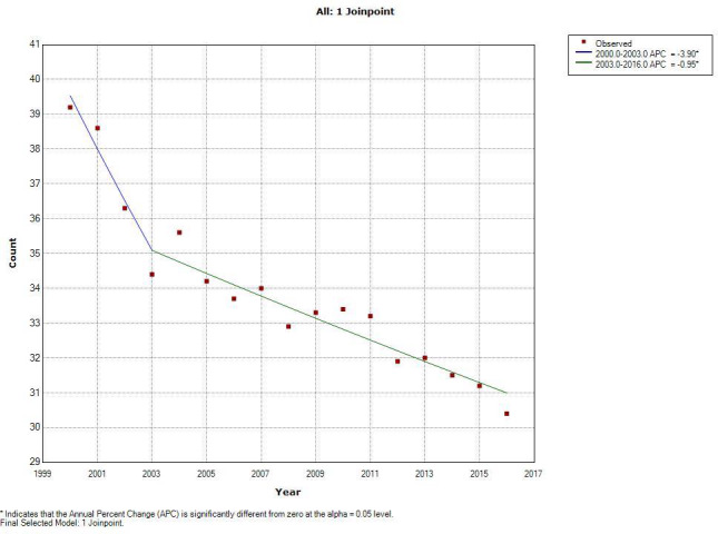
This figure shows the joinpoint analysis of non‐HPV related sites. The line represents the model crude rate and the red dots represent the observed crude rate. The slope of the line is the APC (annual percent change) in incidence

This figure shows the joinpoint analysis of non‐HPV related sites. The line represents the model crude rate and the red dots represent the observed crude rate. The slope of the line is the APC (annual percent change) in incidence