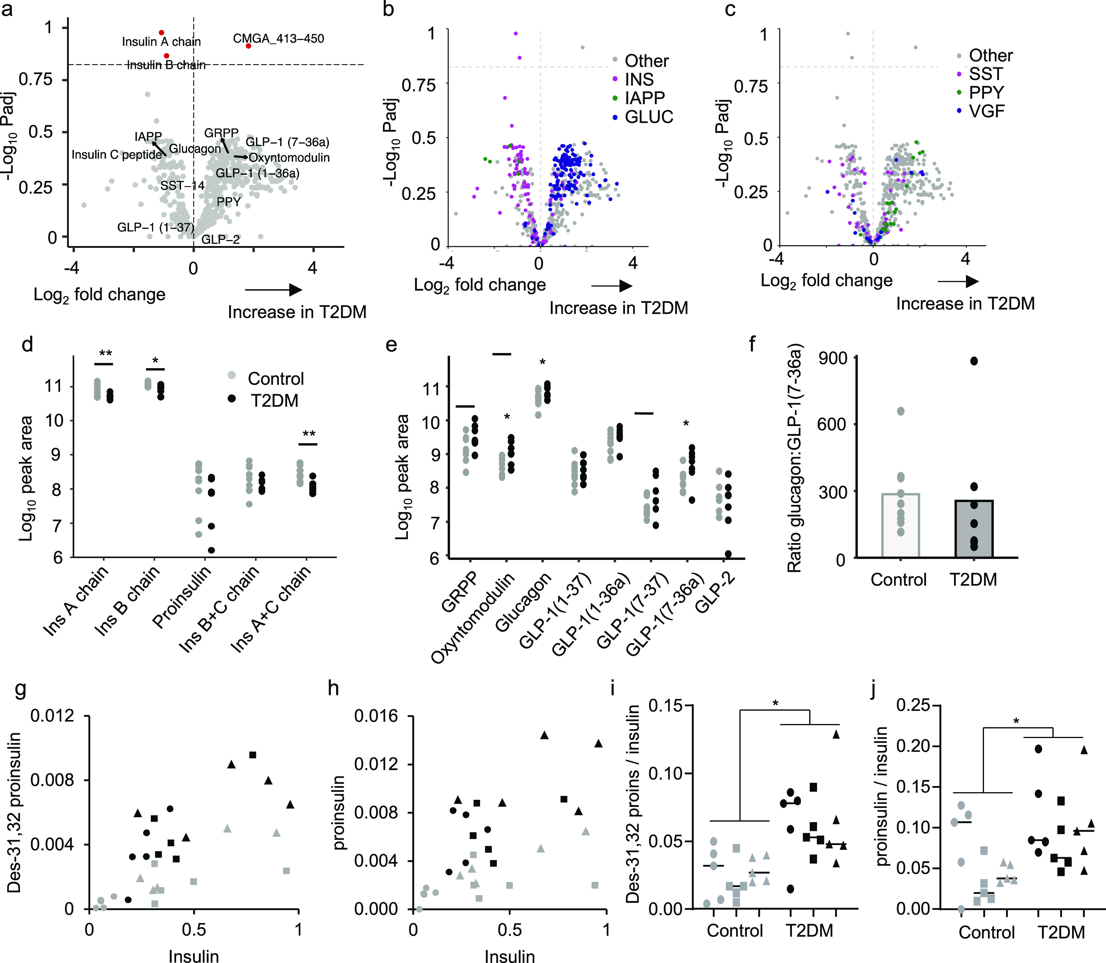
Figure 5.

Peptidomic comparison of human islets from type 2 diabetic individuals compared to nondiabetic controls. (a) Volcano plot displaying log2 fold change vs −log10 of the adjusted p value for each peptide. Horizontal dotted lines indicates p = 0.15. A positive log2 fold change indicates an increase in T2DM. (b,c) Volcano plots displaying in different colors individual peptides derived from proIAPP, proinsulin, and proglucagon (b), and from prosomatostatin, proPPY, and proVGF (c). (d,e) Manually quantified peak areas of processed insulin chains and proinsulin (d), and products of proglucagon processing (e). (f) Ratio of peak area of glucagon:GLP-1(7–36amide) in all samples. Statistical comparison made using unpaired t test without adjustments for multiple comparisons. *p < 0.05. For a–f, n = 9 for the control group and n = 7 for T2DM group. Donors were excluded from the analysis if the samples failed to load properly onto the SPE sorbent. (g,h) Plasma des-31,32 proinsulin (g) and proinsulin (h) plotted against insulin for control (gray) and T2DM (black) subjects in the fasting state (circles), and 30 min (squares) or 90 min (triangles) after a 75 g oral glucose tolerance test. Values represent peak area ratios. (i,j) Ratios of data shown in (g,h). *p < 0.05 between controls and T2DM by 2-way ANOVA.
