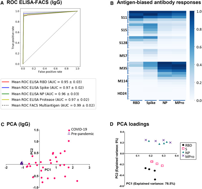
Figure 2.

(A) ROC curves comparing single‐antigen ELISA and multi‐antigen FACS assays. A random forest classifier, trained with IgG values from one healthy and two COVID samples was used to predict the rest of the samples. The mean ROC curve after 15‐fold cross‐validation is shown for each condition. (B) Antigen‐biased antibody responses. Heat map of patients with biased IgG response against either S/RBD or NP/Mpro viral antigens. Data from 6 patients and 1 healthy donor are shown. (B) PCA of IgG. Triangles and circles represent pre‐pandemic controls and COVID‐19 patients, respectively. (C) PCA loadings. Visual representation of the loadings of the two first principal components. Each dilution of IgG titer against RBD, Spike, NP, and MPro is represented as a separate variable.
