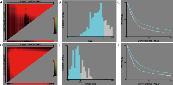
Figure 2.
Selection of the best cutoff points. (A) The coloration of the plot represents the strength of the association, ranging from low (dark, black) to high (green or red). Indirect associations between age and survival are in red, whereas positive associations are in green; (B) the histogram shows the optimal cutoff point of age (blue: age ≤72 years old, gray: age >72 years old); (C) the Kaplan-Meier curve shows the corresponding cutoff point of age (blue: age ≤72 years old, gray: age >72 years old); (D) the coloration of the plot represents the strength of the association, ranging from low (dark, black) to high (green or red). Indirect associations between tumor size and survival are in red, whereas positive associations are colored green; (E) the histogram shows the optimal cutoff point of tumor size (blue: tumor size ≤63 mm, gray: age >63 mm); (F) the Kaplan-Meier curve shows the corresponding cutoff point of tumor size (blue: tumor size ≤63 mm, gray: age >63 mm).

