Figure 1.
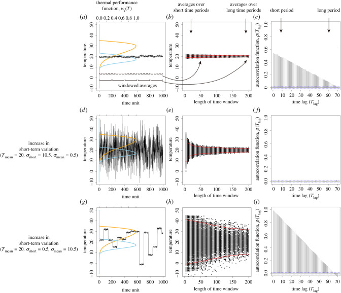
A demonstration of the species and environmental variation properties in our model. (a) Following the concept of biological performance curves, the difference between the two species can be depicted by the per capita growth rates across all environments (i.e. temperatures). We assume that there is a high temperature-adapted species (orange curve; species 1) and a low temperature-adapted species (blue curve; species 2) competing against one another (see also Methods). The solid black line describes the time series of temperature variation. (b) To better visualize the fluctuations at different temporal scales, we divide the time series into many fractions with equal durations (i.e. window lengths) and calculate the windowed averages of each fraction. This visualization allows us to visualize the rate of convergence of the windowed average, where the red dots are the average plus or minus two standard deviations of the windowed averages for different time windows. (c) Alternatively, the temperature time series can be analysed using the autocorrelation function, where autocorrelation coefficients are plotted along with each time lag. The blue dashed lines indicate the confidence interval of the autocorrelation function; autocorrelation coefficients larger than the interval are statistically significant. (d–f) The time series, windowed averages and autocorrelation function of another temperature time series with an increased short-term variation. (g–i) The same analyses for the other temperature time series where long-term variation is increased. (Online version in colour.)

