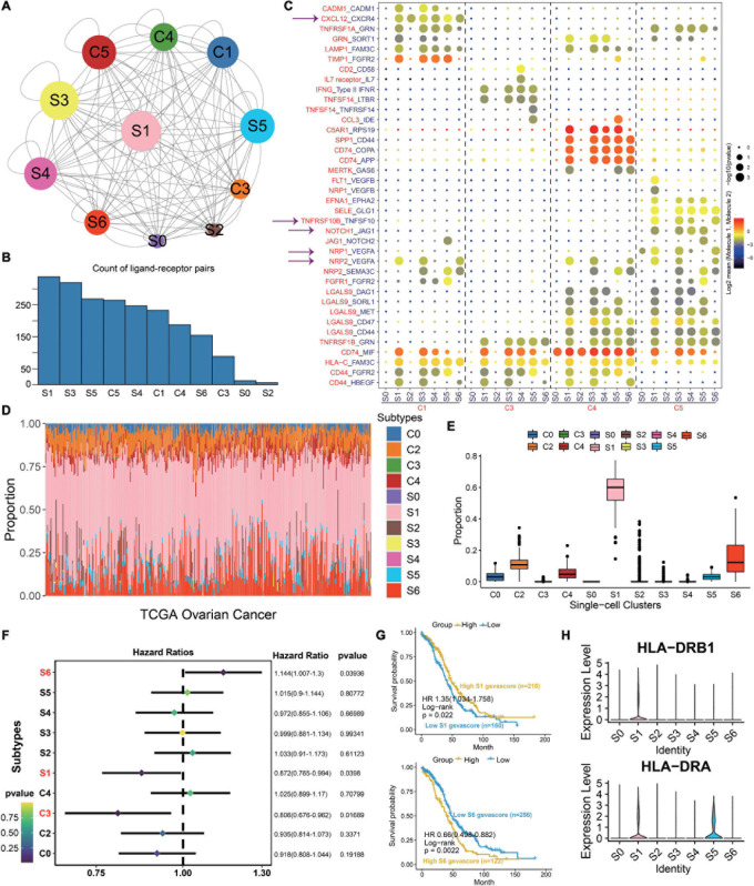
FIGURE 3.
S1 is the dominant subtype in malignant epithelial subgroups. (A) Interaction network constructed by CellPhoneDB; circle size represents interaction counts. (B) Bar plot illustrating the count of ligand–receptor pairs. (C) Dot plot showing ligand–receptor pairs of malignant epithelial subgroups and other clusters. (D) Stacked bar plot summarizing cell subtype fractions with the deconvolution result of 379 OCs from TCGA. Colors of the bars represent 11 cell states as shown in the legend. The y-axis represents the proportion of each state in a tumor sample. In the x-axis, each column represents one tumor case. (E) Box plot illustrating the proportion of each state in TCGA OC samples. (F) Association between relative abundance of cell states calculated by CIBERSORT and survival. (G) Kaplan–Meier curves for the relative abundance of S1 and S6. (H) Violin plots exhibiting the MHC molecules such as HLA-DRB1 and HLA-DRA across different subtypes. The y-axis was the normalized read count.

