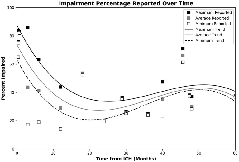
Figure 2.
Plot of post-ICH CI percentages, with trendlines reflecting the maximum, minimum, and average observed CI proportions. Data for the maximum, average, and minimum data points are, respectively, shown by the black, gray, and open white markers. Respective CI trends are shown using black, gray, and dashed lines. Impairment appeared highest during the acute phase, dropped to a minimum during the 20–24-month timespan, and steadily increased over the remaining observed timespan.

