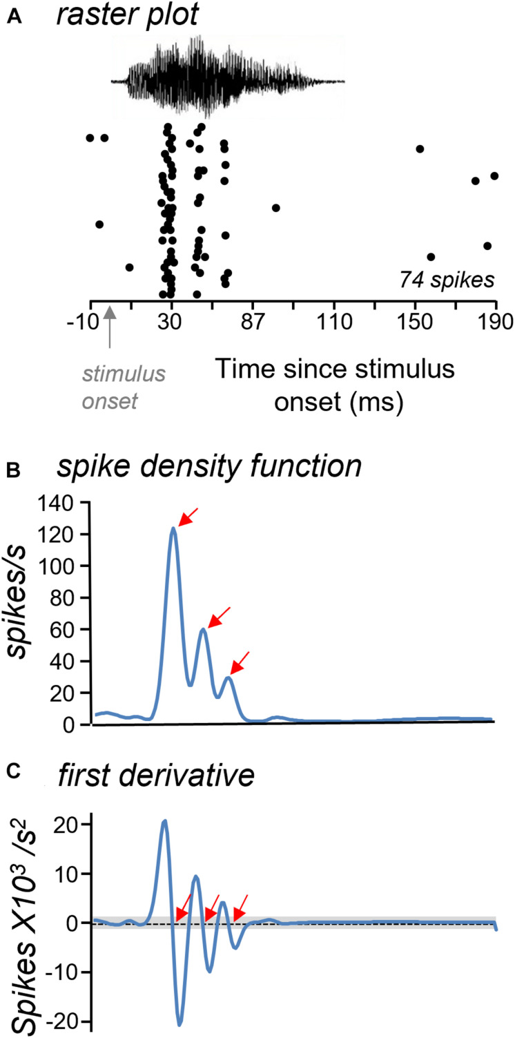
FIGURE 3.
Approach for measuring response features. (A) Raster plots were used to generate spike density functions. (B) Spike density function with three clear peaks (arrows) illustrating periods of high spike probability. (C) Response features were identified from the first derivative of the spike density functions as null crossings that were higher and lower than the threshold criterion (gray bar). Red arrows mark identified response features. The time axis is the same in all plots.

