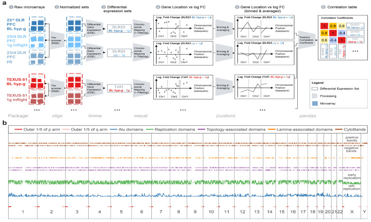
Figure 10.
Components of the analysis pipelines. (a) Schematic overview of the sample analysis pipeline. (1) Raw array data were available as CEL files for all compared experiments (except for control experiment 2 that was already in a normalized state). (2) Raw array data were RMA-normalized (Robust Multiarray Averaging) and converted into experiment-wise transcript cluster data. (3) Differential gene expression comparisons were calculated with Bioconductor limma by fitting a linear Bayesian model to the data. (4) Data were annotated with their distinct localization on the human genome and mapped to all chromosomes. Only uniquely mapping genes were kept; additionally, only the top 2000 differentially expressed genes were included. (5) Genes were binned into bins of 10,000,000 bp and averaged within bins. The bin logarithmic fold change averages were plotted at the middle of the bins, chromosome by chromosome. (6) The Spearman correlation coefficients of all bin averages were calculated between different DGEs comparisons, yielding a correlation coefficients table with all DGEs comparisons. The value between two identical sets is always 1 and is represented on the diagonal. (b) Distribution of all DNA motifs that were used in linear models for the hypotheses testing. The horizontal axis shows the chromosomes, from chr1 to chrY, aligned from the beginning of the p arm to the end of the q arm. The outer 1/5 of the p/q arm are displayed in red, and the number of Alu domains within 100,000 bp on the same chromosome is displayed per location in blue, on a relative scale.

