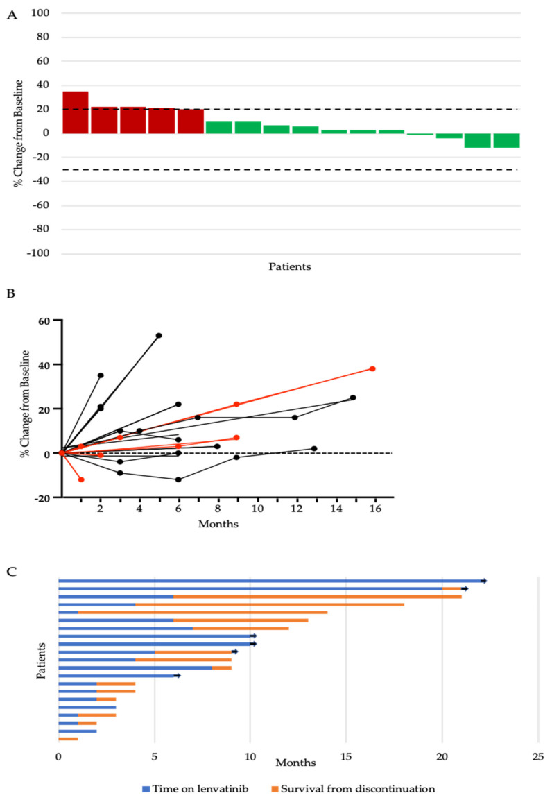
Figure 1.
(A) Waterfall plot of maximum percent change in tumour size from baseline as measured by Response Evaluation Criteria in Solid Tumour (RECIST). The upper dotted line represents the threshold for progressive disease (a 20% increase in the sum of the longest diameter of the target lesions) and the lower dotted line represents the threshold for partial response (a 30% decrease in the sum of the longest diameter of the target lesions). (B) Change from the baseline (%) in the sum of the target lesions over time. Red lines represent patients on a starting dose of 24 mg. Black lines represent patients starting on a reduced dose. (C) Swimmers plot of time from the start of lenvatinib to the time of discontinuation (blue bar) and survival from discontinuation to death or last follow-up (orange bar). Each bar represents an individual patient, with the length of the bar corresponding to the time of overall survival. Arrow indicates patient is alive.

