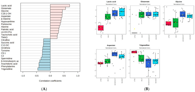
Figure 2.
Pattern correlation analysis. (A) The analysis was performed correlating the metabolome features with a pattern of concentration increasing toward the degree of COVID-19 severity, in the order from control, to mild, to moderate, to severe patients. The graph reports the significant features detected ordered according to their correlation coefficient. Pink and light blue bars refer to positively and negatively correlated metabolites, respectively. (B) The box and whisker plots summarize the normalized values of five selected metabolites, with a correlation coefficient ≳0.5 or ≲−0.5 and lower standard deviations.

