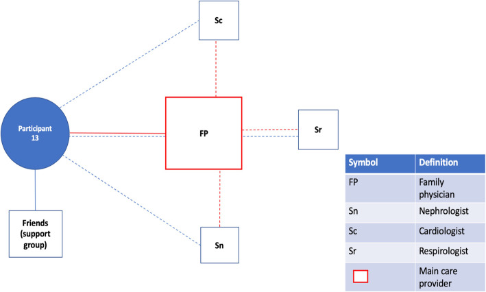
Fig. 1.
Patient Network of Care Diagram. A diagram such as this one was created for each study participant using information gained from the bedside interview. If a main care provider could be identified, they were displayed on the network diagram in red. For formally rostered patients, it was not assumed that the main care provider was their FP. Instead, the main care provider was the one the participants saw as the key care figure in their everyday life, or the one providing services of greatest importance to them. Distances from the patient to the provider were used as representations for the frequency of appointments with the provider. These were estimated based on direct questions about how frequently each provider was seen. A similar logic was used to dictate the size of the box for each provider, representing the relative importance of the provider to the patient and their network of care. Lines were used to connect patients to providers and providers to providers. Solid lines indicated relationships between patients and providers that had a personal dimension to them (patient and provider knew one another). In contrast, dashed lines between patients and providers indicated the provider was either an entity such as a hospital or where patient and provider were very unlikely to have a personal relationship based on the nature of the association (e.g. one-time specialist consultation). Dashed lines between providers indicated the existence of patient-focused communication between them. Patient-focused communication involving the main care provider was once again captured in red. Lastly, social supports were included in the network of care diagram

