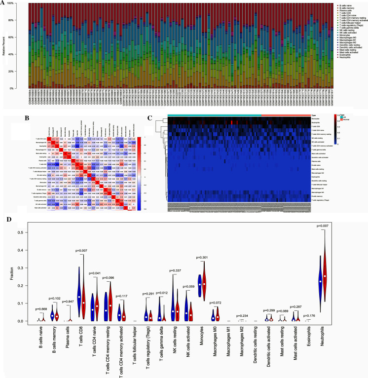
Figure 5. The profiles of immune cell subtype distribution pattern in GSE25101 and GSE73754 cohort.
(A) The bar plot visualizing the relative percent of 22 immune cell in each sample. (B) Heatmap of the 22 immune cell proportions in each sample. (C) Correlation heatmap of all 22 immune cells. (D) Violin plot of all 22 immune cells differentially infiltrated fraction.

