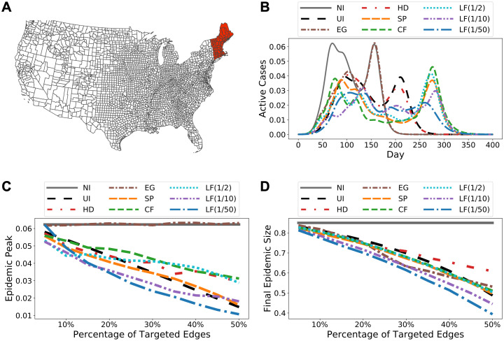
Fig 3. Simulation results for Facebook County.
(A) Initially infected cluster of counties. (B) Predicted epidemic curves at 25% coverage level, i.e., intervention is applied to 25% of all edges, along with the original epidemic curve without intervention (NI). The abbreviations in the legend are introduced at the beginning of Results. LF(a), where a ∈ {1/2, 1/10, 1/50}, represents LF intervention with parameter λ = a. (C) Predicted epidemic peaks (peak prevalence) over a range of intervention coverage levels. (D) Predicted epidemic sizes (total infection) over a range of intervention coverage levels. Observe that EG intervention does not reduce peak prevalence at all. This is likely due to the epidemic curve has two modes and EG mostly targets on edges connected to the counties where the first peak happens, e.g., Fig 3B shows that EG significantly reduces the first epidemic peak but has almost no effect on the second. Fig 3A uses Plotly Python Open Source Graphing Library [41] with base map data from Natural Earth @ naturalearthdata.com. Direct link to base map data: https://www.naturalearthdata.com/http//www.naturalearthdata.com/download/110m/cultural/ne_110m_admin_1_states_provinces.zip.

