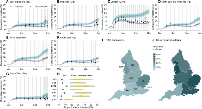
Fig. 5. Cumulative COVID-19 incidence and seropositivity by region.
(A to G) Comparison of the estimated proportion of the population testing seropositive in 2020 with observations from serological surveys [see section S1.1.4 (14)]. Vertical gray shaded bands show serological survey timings, black points show the observed seroprevalence (bars, 95% exact confidence intervals), and blue and purple lines show the proportion of the population infected and seropositive, respectively, as inferred from our model (shaded bands show the 95% CrI, 50% CrI, and median). (H) Comparison by region of the estimated cumulative attack rate (median and 95% CrI) in care home residents (yellow, excludes care home workers) versus in the 80+ age group in the community (blue). The estimated mean final epidemic size in each England NHS region (I) in total and (J) in care home residents (excludes care home workers).

