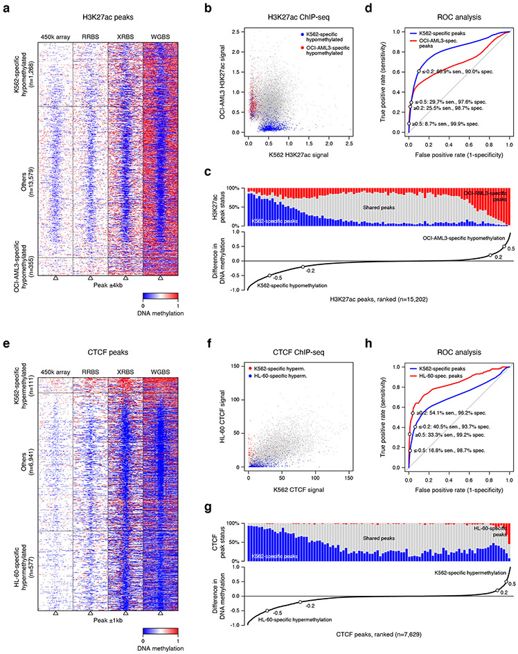
Extended Data Fig. 7 ∣. Evaluating the use of XRBS DNA methylation profiling to predict H3K27 acetylation and CTCF binding.
A) Heatmap depicts 8kb regions (rows, n=15,202 peaks) centered on H3K27ac peaks, grouped into regions that are hypomethylated specifically in K562 or OCI-AML3 cells (as in Fig. 4b). Peaks that are not specifically hypomethylated (‘Others’) are downsampled for visualization. Regions are divided into 100 equally sized windows. Panels from left to right show: methylation calls from 450k methylation array, RRBS, XRBS, and WGBS. All datasets except XRBS were retrieved from ENCODE 51.
B) Scatterplot shows merged H3K27ac peaks from OCI-AML3 and K562 ChIP-seq datasets. Individual peaks (dots) are colored if specifically hypomethylated in K562 (blue) or OCI-AML3 (red) cells.
C) Line plot (bottom) shows difference in methylation between K562 and OCI-AML3 cells over merged H3K27ac peaks (n=15,202 peaks). Of these peaks, 7.5% and 2.1% are specifically hypomethylated in K562 (methylation difference ≤−0.5) and OCI-AML3 (≥0.5) cells, respectively. Bar plot (top) shows the fraction of cell line-specific H3K27ac peaks within 100 equally sized bins grouped by difference in methylation. Shared peaks are indicated in gray.
D) Receiver operating characteristic (ROC) curve shows performance of predicting cell line-specific H3K27ac peaks based on difference in DNA methylation over peaks that are covered by XRBS. Sensitivity and specificity are indicated at different thresholds (±0.2 and ±0.5, as in panel C).
E) Heatmap depicts 2kb regions (rows, n=7,629 peaks) centered at merged CTCF peaks from K562 and HL-60 Chip-seq datasets. Individual peaks (dots) are colored if specifically hypermethylated in K562 or HL-60 cells (as in Fig. 4c). Peaks not specifically hypermethylated (‘Others’) are downsampled for visualization. Panels from left to right show methylation calls from 450k methylation arrays, RRBS, XRBS, and WGBS. All datasets except XRBS were retrieved from ENCODE 51.
F) Scatterplot shows merged CTCF peaks from K562 and HL-60 ChIP-seq datasets. Individual CTCF binding sites (dots) are colored if specifically hypermethylated in K562 (red) or HL-60 (blue) cells.
G) Line plot (bottom) shows difference in methylation between K562 and HL-60 cells over merged CTCF peaks (n=7,629 peaks). Bar plot (top) shows the fraction of cell line-specific CTCF peaks within 100 equally sized bins grouped by difference in methylation. Shared peaks are indicated in gray.
H) ROC curve shows performance of predicting cell line-specific CTCF peaks based on difference in DNA methylation over peaks that are covered by XRBS. Sensitivity and specificity are indicated at different thresholds (±0.2 and ±0.5, as in panel G).

