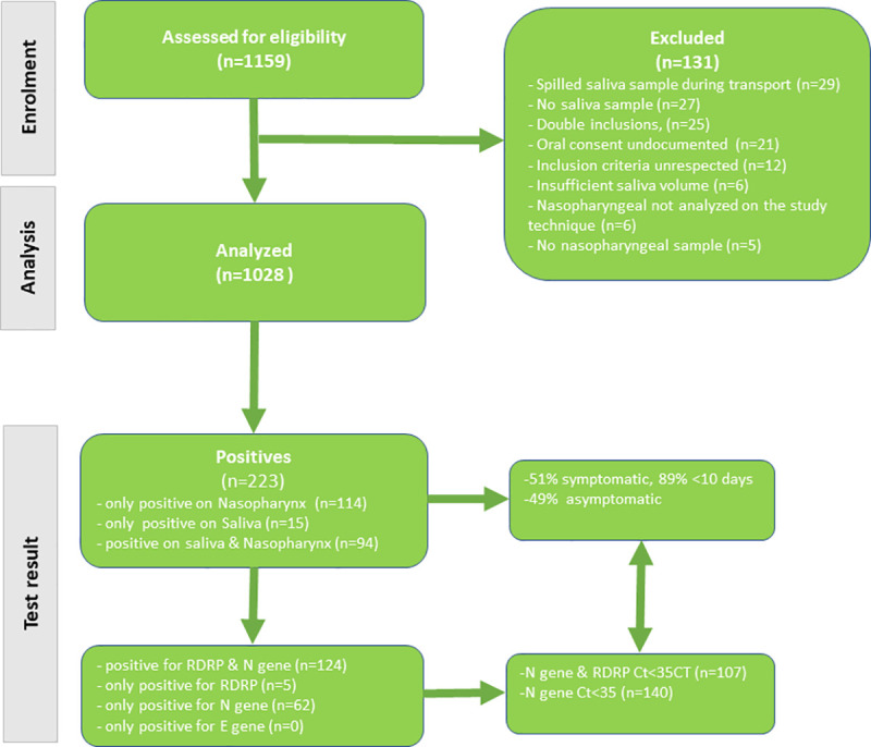
Fig 1. COVISAL study flowchart.

The top half of the flowchart shows the cascade of the number of patients screened and the number of patients that were included in the analysis and the reasons why some were excluded. The bottom half of the flowchart shows the number of ‘positives’ (according to the manufacturer) by type of sample and the proportion of symptomatic patients and among these those that had symptoms less than 10 days before inclusion. Finally, the bottom left of the flowchart breaks down positives by target gene and the bottom right shows the number of positives with Ct <35, which are assumed to be most infectious and most important to detect.
