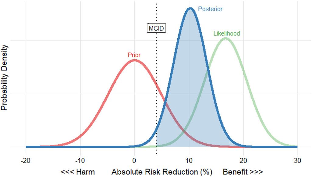
Figure 1 – Example Plot of Prior, Likelihood, and Posterior Distribution Using the Guérin (2013) “PROSEVA” Trial39.
This figure shows the prior (red curve), likelihood of observed data (green curve), and posterior (blue curve) plotted together with absolute risk reduction on the x-axis and probability density on the y-axis. The prior distribution is skeptical, centered at an absolute risk reduction of 0, with variance equivalent to a 400-person trial. The likelihood is centered at the observed absolute risk reduction of the trial and has lower variance than the prior because the trial enrolled 466 patients. The posterior combines the prior and likelihood, resulting in a compromise between skepticism (perhaps based on previous proning trials, or the broader context of clinical trials in ventilation) and the observed mortality reduction. Although the posterior distribution is attenuated relative to the data, the resulting posterior probability of exceeding the 4% minimum clinically important difference (blue shaded area) is 98%, providing strong evidence that proning is beneficial even if one is skeptical before seeing the data from Guérin et al. Similar plots with user-specified MCID and prior distributions are available for every trial in the analysis through the accompanying interactive app.

