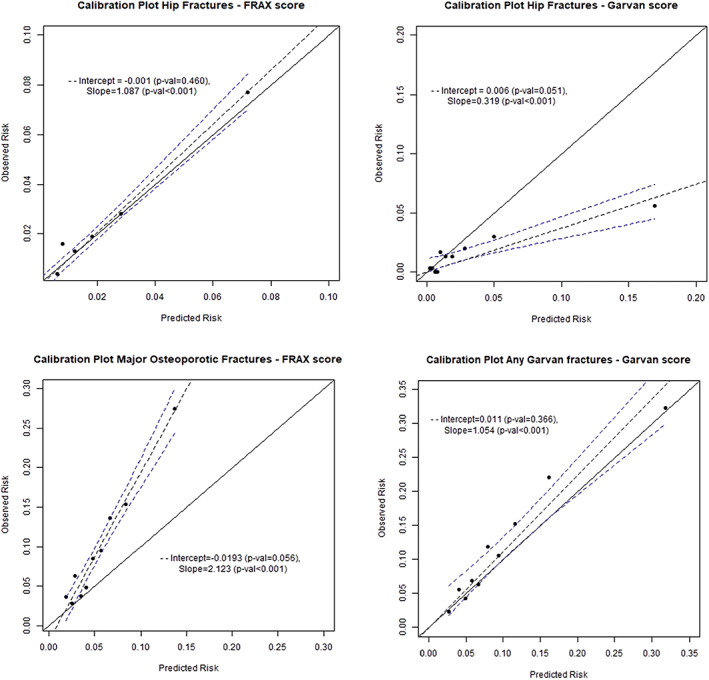
Fig 1.

Calibration of the calculators. Each panel shows a plot of the observed probability of fracture versus the mean estimated fracture probability for the cohort divided by decile of estimated probability. The solid line represents a perfectly calibrated model, and the dotted lines the line of best fit with its 95% confidence interval.
