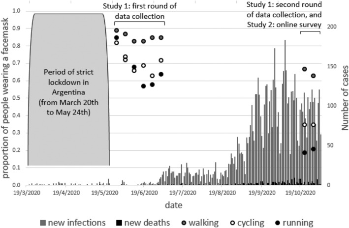
FIGURE 1.

The Y axis on the left shows the proportion of people wearing a face mask as a function of week and activity (circles in the figure), whereas the right Y axis shows the number of new COVID‐19 cases and deaths on those weeks in Bahía Blanca (bars in the figure). The figure also shows the dates in which Studies 1 and 2 were run
