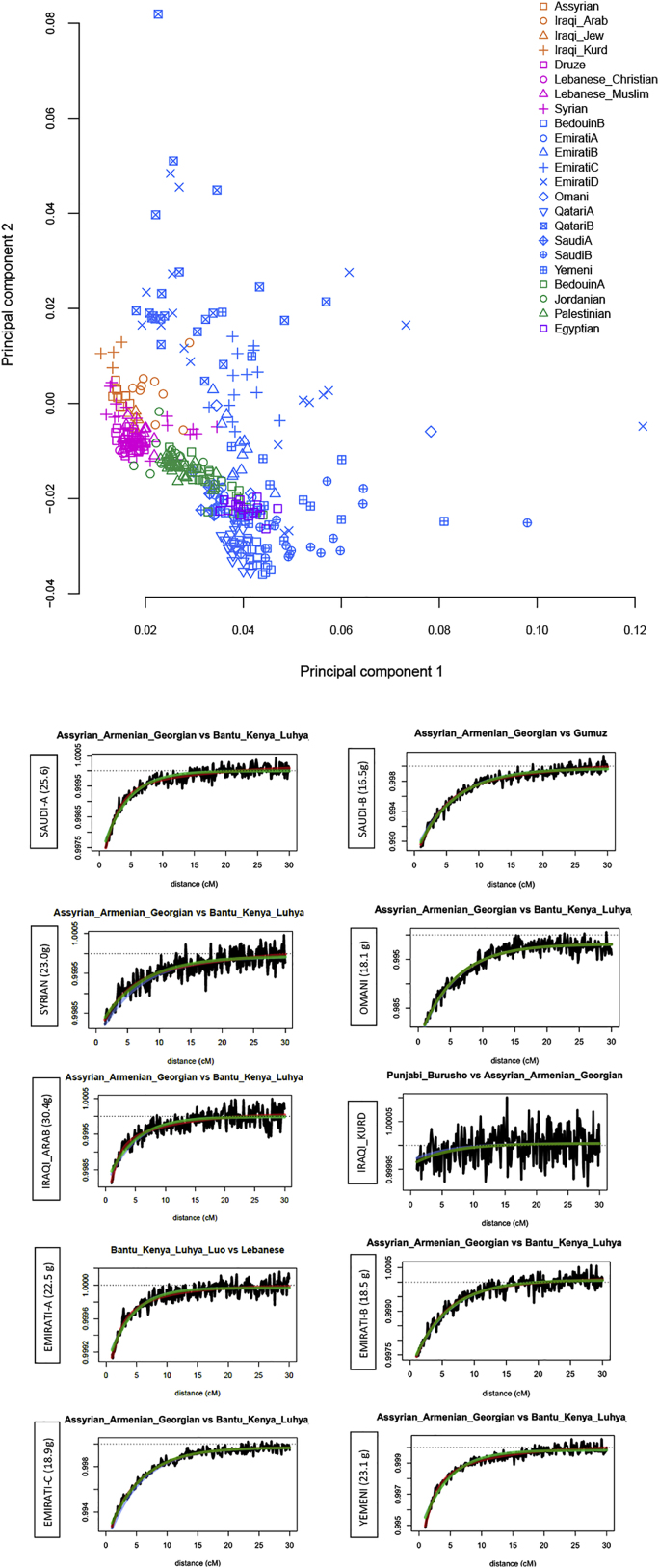
Figure S1.
Population structure and admixture, related to Figure 1
Top: Principal component analysis. Plot similar to Figure 1D but magnifying the modern Middle Eastern cluster and also including other subpopulations (e.g., EmiratiB and QatariB). Bottom: Testing for recent admixture using modern population as sources with GLOBETROTTER. Co-ancestry curves showing relative probability of jointly copying two chunks from donors at varying genetic distances. The curves fit an exponential decay (1-date green line, 2-date red line). The positive slope implies that these donors represent potential proxies to the admixing sources. The estimated admixture date is illustrated on the left of each figure, g for generations. We find that the two putative sources are always a Middle Eastern and an East African population. The dates are in general agreement with MALDER (Table S1). The Iraqi_Kurds are notable for not showing evidence of recent admixture.

