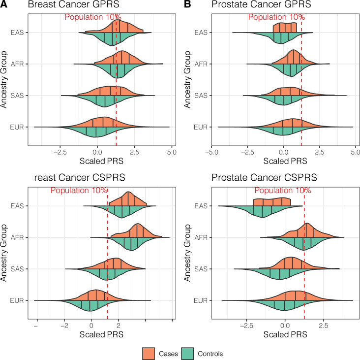
Fig 1. Violin plots of the breast and prostate cancer PRS distributions.
Breast cancer (left) and prostate cancer (right) GPRS (GWAS hit-based PRS, top) and CSPRS (PRS-CS-based PRS, bottom) stratified by ancestry group are shown. Black vertical lines indicate 25, 50, and 75% quantiles within the ancestry-specific case (orange) and control (green) distributions. Red lines indicate 10% quantiles of the corresponding UKB PRS distribution in all controls. Sample sizes for each sub-set can be found in Table 1.

