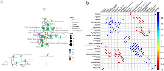
Figure 3.
Genus correlation analysis. (a) Genus correlation network (“igraph” package in R sofware v.3.6.0, https://www.r-project.org/). Different color of the circles represent different phylum of different genus. Size of the circles and color of the lines represent the degree of correlation. Size of the circles change with the right size scale and color changes with the color scale at the bottom right. (b) Corrplot of genus correlation (“corrplot” package in R sofware v.3.6.0, https://www.r-project.org/). Size of the ellipses in the diagram represent the absolute value of the correlation coefficient (the greater the absolute value of the correlation, the smaller the ellipse), the right-slanted ones are positive correlation, the left-slanted ones are negative correlation, and the color changes with the right color scale. The figure only shows correlated genus when statistically significant, *p < 0.05 and FDR < 0.05.

