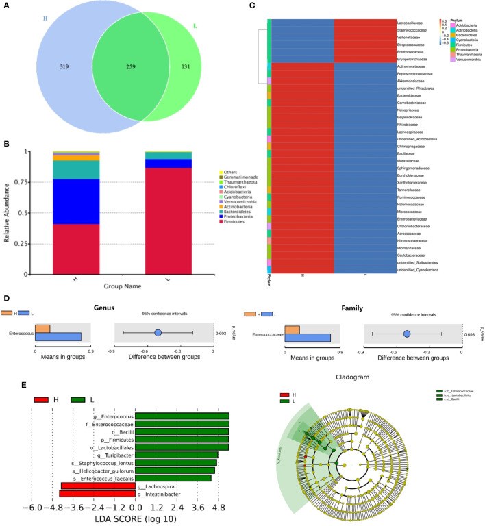
Figure 2.
The comparison of the intestinal flora abundance of recipients on posttransplant 14 days between high number of mucosa-associated invariant T (MAIT) cells (>5.3 × 10⁶/kg, H group, n = 12) and low number of MAIT cells (<5.3 × 10⁶/kg, L group, n = 10) in infused grafts. (A) Venn diagram, each circle represents a group, the number in the overlapped part of the circle and circle represent the number of operational taxonomic units (OTUs) shared between the two groups, and the number without overlap represents the unique OTUs of the group. (B) The column chart of relative abundance of species at phylum level. The abscissa is the group name. The ordinate (Relative Abundance) represents the relative abundance. Others represents the sum of the relative abundances of all the phyla except these 10 phyla in the figure. (C) Cluster heat map of species abundance at the genus level. According to the species annotation and abundance information of all samples at the genus level, select the top 35 abundant genera. (D) T-test species difference analysis diagram at the genus and family levels between H and L groups. (E) Latent Dirichlet Allocation (LDA) score distribution histogram and cladogram. The LDA score distribution histogram shows the Biomarker species with statistical differences between the groups whose LDA Score is greater than the set value (the default setting is 4). The length of the histogram represents the impact of different species (that is, LDA Score). In the cladogram, the circles radiating from the inside to the outside represent the taxonomic level from the phylum to the genus (or species).

