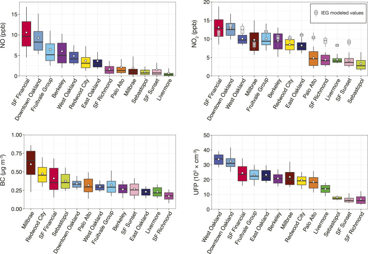
Fig. 2.
Exposure distributions by neighborhood, based on daytime, weekday census block concentrations. Areas are shown in order of descending median concentration. Whisker ends represent 10th and 90th percentiles, box boundaries represent upper and lower quartiles, the center bar marks the median, and the circle represents the mean. Gray box plots in the NO2 panel represent modeled exposure estimates from a national-scale IEG regression model (17).

