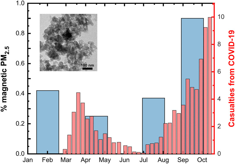
Fig. 1.
The disease progression timeline and the seasonal variability of the airborne magnetite pollutant. The thin red bars represent the 7-period moving average for new daily confirmed deaths from COVID-19 in Greece. Note that there is about a four weeks delay from first symptoms after infection to death. The thick blue bars depict the percentage of magnetic material estimated from PM2.5 observations at urban site in Thessaloniki, representatively for the years 2015–2018. The inset shows a representative TEM image of the magnetic dust. We ascribe these particles to high-temperature anthropogenic processes, e.g. industrial and traffic sources, but can also result from natural fires, desert dust plumes and cosmic flux. (For interpretation of the references to colour in this figure legend, the reader is referred to the Web version of this article.)

