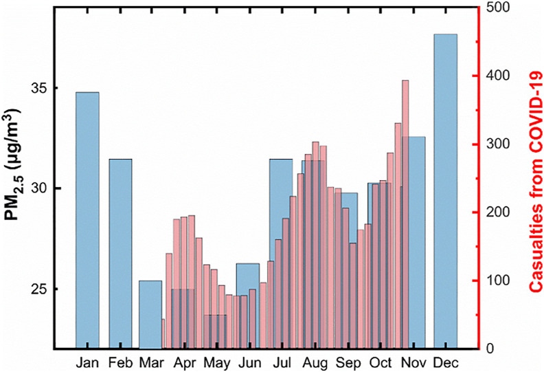
Fig. 2.
Two or more ‘camel humps' in Iran. The thick blue bars depict the monthly pattern of PM2.5 mass concentrations during the period (2011–2016) in Tehran. The thin red bars represent the 7-period moving average for new daily confirmed deaths from COVID-19 in Iran, as of October 28, 2020. (For interpretation of the references to colour in this figure legend, the reader is referred to the Web version of this article.)

