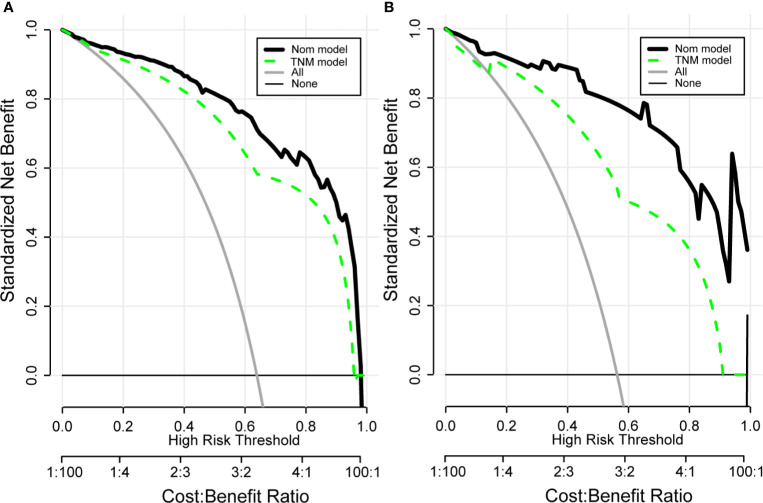
Figure 7.
Clinical decision curve analysis (DCA) of the training group (A) and validation group (B) for clinical benefits. Comparison of DCA between Nom model and TNM model. X-axis stands for threshold probability. Y-axis stands for the net benefit after the advantage minus the disadvantage. The black horizontal line indicates that all samples are negative, which means none of the patients received interventions and the net benefit is 0; The gray oblique line indicates that all samples are positive and all patients received interventions. Nom model included AFP, VHS, CV, RT, TNM, PTS. TNM Model included T-stage, N-stage, and M-stage.

