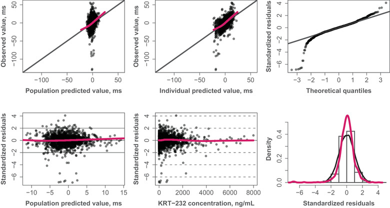
Figure 3.

Goodness‐of‐fit plots. Red curves represent LOESS (locally weighted scatterplot smoothing). The filled circles represent individual data points. The black solid lines represent the identity line or line through first and third quartiles (quantile‐quantile plot).
