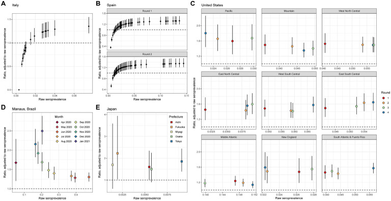
Figure 5: Relative bias in seroprevalence estimation.
For each panel, the raw seroprevalence result is shown on the x-axis and the ratio of the adjusted to raw seroprevalence is shown on the y-axis (median and 95% credible interval). The ratio equaling 1 (i.e., no bias) is shown in the dashed line. All panels are generated under the primary scenario of classifying disease severity into 2 groups, non-hospitalized and hospitalized. (A) Italy, where each point represents a region. (B) Spain, for (upper) Round 1 and (lower) Round 2, where each point represents a province. (C) The 9 census divisions of the United States, where the color of the point represents the survey round. (D) Manaus, Brazil, where each point represents a month. As in Figure 4, for panels C and D, the adjusted seroprevalence estimates are weighted by population demography and age-specific disease severity. (E) Japan, where each point represents a prefecture. The scenario considered here is the case of using the results of the two assays.

