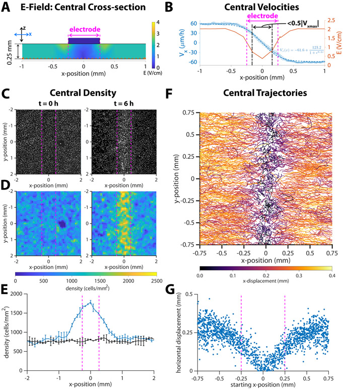
Figure 4.
Response of migrating cells near the center of a closed tissue. Dotted vertical magenta lines indicate approximate cathode boundaries in each respective graph. (A) Numeric simulation results for the electric field of the channel in cross section. The horizontal dotted line is the section of the electric field plotted in the next panel. (B) Average horizontal velocity plotted as blue *’s with error bars representing standard deviation (N = 2). The dashed blue line indicates a least-squares fit of a sigmoid function to the data, and the formula for this fit is inset in the lower right quadrant of the plot. The region where the horizontal velocity’s magnitude drops to < 50% of the steady state value is marked by dot- dash black lines. Predicted strength from numeric simulation (reproduced from Figure 1E) is plotted as a red solid line. (C) DAPI images of cell nuclei and (D) density maps for tissues at the onset of stimulation (t = 0 h) and after six hours of stimulation (t = 6 h). (E) Average cell density versus x-position, where x = 0 is the center of the cathode. Error bars represent standard deviation (N = 2). (F) Montage of 6-hour trajectories of individual cells in proximity with the center. Each track is coloured by net x-displacement. (G) Total horizontal displacement of cell versus its starting x-position relative to the center of the cathode at x = 0.

