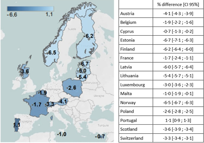
Fig. 1a.
Difference in prevalence of SGA between international and national birthweight charts This map shows the geographic pattern of differences in SGA prevalence depending on the use of international compared to national birthweight charts, with the lightest blue color denoting countries where differences between the charts are most pronounced. Differences are largest in the north of Europe where international charts give lower SGA prevalence than the national charts.

