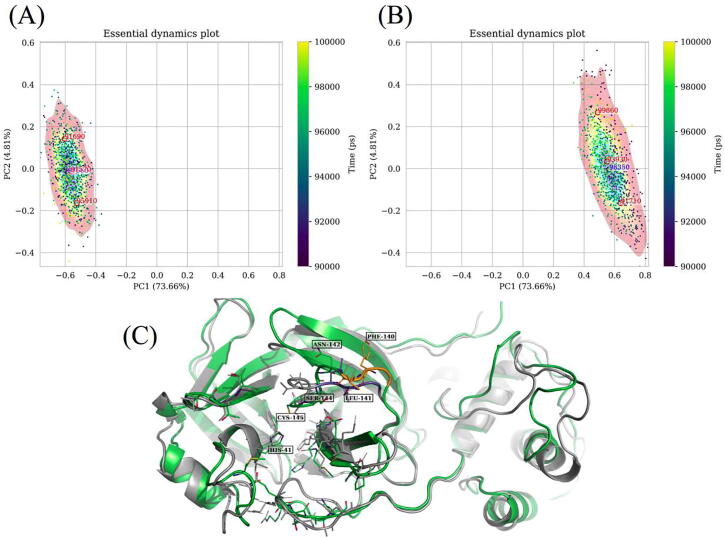
Fig. 8.
Representations of conformational sampling from independent MD simulations of (A) a reference and (B) an early pandemic stage mutant of the dimeric SARS-CoV-2 Mpro in the same eigen subspace, using comparative essential dynamics. Dots correspond to individual protein conformations (defined by a selection) and are colored by the time of sampling. The kernel density contour plots [colored from blue (lowest density) through yellow to red (highest density)] only serve as a visual guide for the energy surface, and are independently scaled, based on the respective samples. The red labels are estimates obtained from the k-means algorithm, while the blue ones are obtained from the probability density maxima. (For interpretation of the references to color in this figure legend, the reader is referred to the web version of this article.)

